Section 2 Initial 200 parallel replicates
Here we plot data associated with the initial 200 replicates.
All data, analysis scripts, etc. are found in the experiment directory: /experiments/alife_2023/2023_02_21_01__initial_10_cooldown/.
2.1 Dependencies
# External
library(ggplot2)
library(dplyr)
source("https://gist.githubusercontent.com/benmarwick/2a1bb0133ff568cbe28d/raw/fb53bd97121f7f9ce947837ef1a4c65a73bffb3f/geom_flat_violin.R")

base_repo_dir = '../..'
exp_dir = paste0(base_repo_dir, '/experiments/alife_2023/2023_02_21_01__initial_10_cooldown')

# Internal
source(paste0(base_repo_dir, '/global_shared_files/constant_vars__three_cues_one_set.R'))
source(paste0(base_repo_dir, '/global_shared_files/shared_funcs__three_cues_one_set.R'))
2.2 Loading data
To save time, we load the pre-processed data.
To see how the data gets processed, please see ./analysis/final_dominant_analysis.R from the experiment directory.
# Data for all trials from all seeds
df = read.csv(paste0(exp_dir, '/data/processed_data/processed_full.csv'))
# One line per seed that summarizes all 100 trials
df_summary = read.csv(paste0(exp_dir, '/data/processed_data/processed_summary.csv'))
# Sumamrize each category, e.g., how many replicates evolved error correction?
classification_summary = read.csv(paste0(exp_dir, '/data/processed_data/processed_classification.csv'))
2.3 Behavior classification summary
Of the 200 initial replicates, how many evolved learning? Error correction?
Here we plot the number of replicates that evolved each behavior. To determine the behavior of the replicate, we analyzed the most abundant genotype at the end of evolution for each replicate.
ggplot(classification_summary, aes(x = seed_classification_factor, y = count, fill = seed_classification_factor)) +
  geom_col() +
  geom_text(aes(y = count + 7, label = count), size = 4) +
  scale_fill_manual(values = color_map) +
  xlab('Classification') +
  ylab('Number of replicates') +
  theme(legend.position = 'none') +
  theme(axis.text.x = element_text(angle=45, vjust = 1, hjust = 1)) +
  theme(axis.text = element_text(size = 10)) +
  theme(axis.title = element_text(size = 12))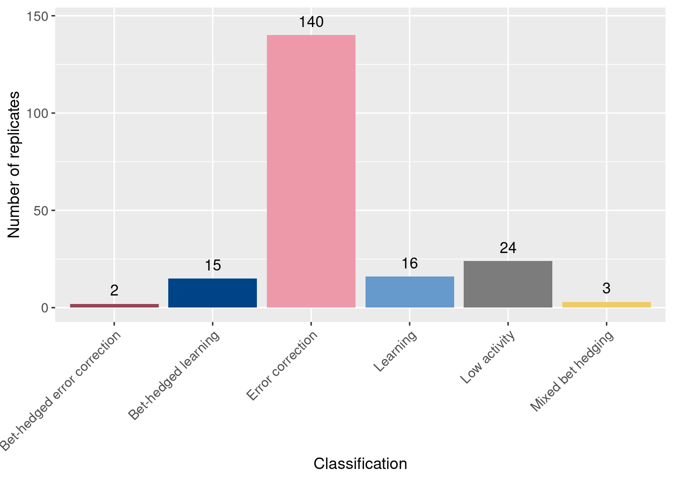
2.4 Accuracy plots
Next, we’ll look at the accuracy (number of non-backwards movements correct / non-backwards movements taken) for each replicate.
Order the points by mean accuracy.
df_summary = df_summary[order(df_summary$accuracy_mean),]
df_summary$seed_order = 1:nrow(df_summary)
df$seed_order = NA
for(seed in unique(df$seed)){
  df[df$seed == seed,]$seed_order = df_summary[df_summary$seed == seed,]$seed_order
}
For each replicate, plot mean accuracy as a solid point and min/max as partially transparent points.
ggplot(df_summary, aes(x = seed_order, color = seed_classification)) +
  geom_point(aes(y = accuracy_mean)) +
  geom_point(aes(y = accuracy_min), alpha = 0.2) +
  geom_point(aes(y = accuracy_max), alpha = 0.2) +
  scale_color_manual(values = color_map) +
  xlab('Replicates (ordered)') +
  ylab('Accuracy') +
  #theme(axis.text.x = element_text(angle=45, vjust = 1, hjust = 1)) +
  theme(axis.text = element_text(size = 10)) +
  theme(axis.title = element_text(size = 12)) +
  labs(color = 'Classification')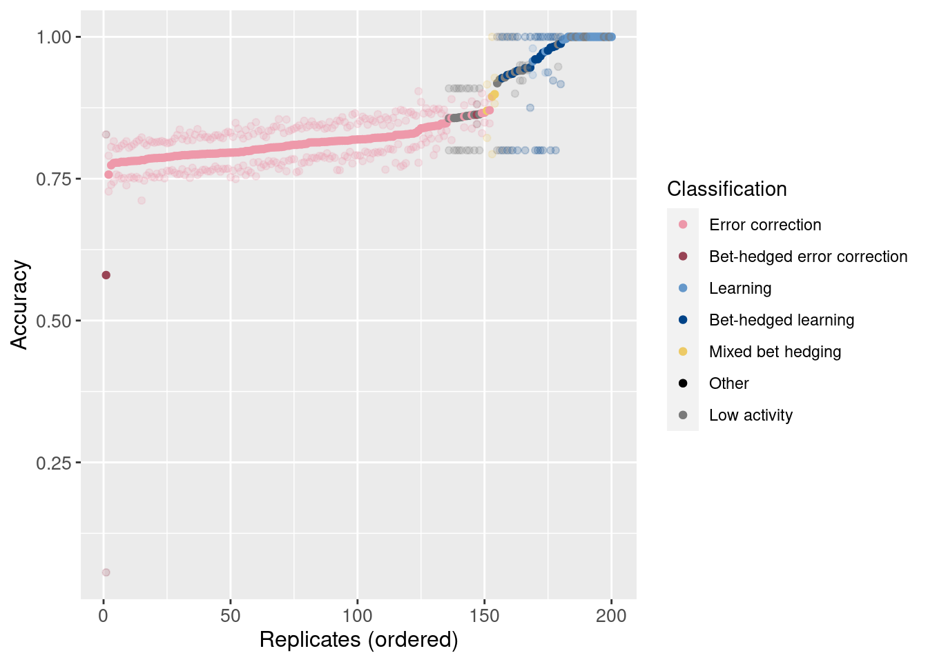
Now plot the accuracy of each sample, maintaining the same order on the x-axis.
ggplot(df, aes(x = seed_order, y = accuracy, color = seed_classification)) +
  geom_point(alpha = 0.2) +
  scale_color_manual(values = color_map) +
  xlab('Replicates (ordered)') +
  ylab('Accuracy') +
  #theme(axis.text.x = element_text(angle=45, vjust = 1, hjust = 1)) +
  theme(axis.text = element_text(size = 10)) +
  theme(axis.title = element_text(size = 12)) +
labs(color = 'Classification') 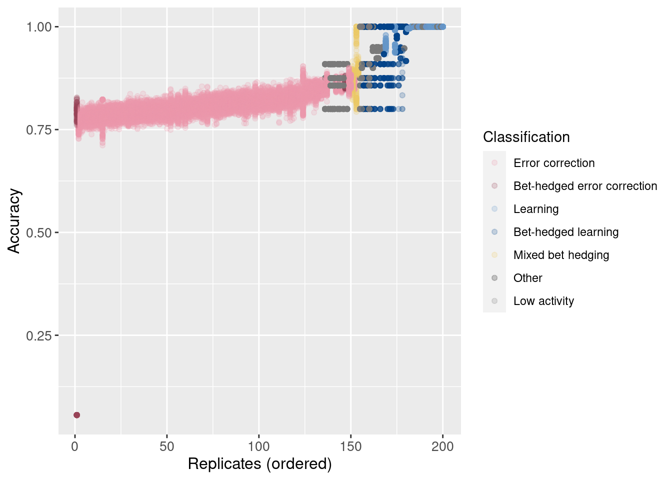
2.5 Raincloud plots (individual trials)
Now, we look at accuracy and merit of individual trials, grouped only by behavior. Thus, all points are individual trials.
# Raincloud plot of accuracy
ggplot(df, aes(x = seed_classification_factor, y = accuracy, fill = seed_classification_factor)) +
  geom_flat_violin(scale="width", position = position_nudge(x = .2, y = 0), alpha = .8 ) +
  geom_point(mapping=aes(color=seed_classification_factor), position = position_jitter(width = .15, height = 0), size = .5, alpha = 0.8 ) +
  geom_boxplot( width = .1, outlier.shape = NA, alpha = 0.5 ) +
  scale_fill_manual(values = color_map) +
  scale_color_manual(values = color_map) +
  xlab('Classification') +
  ylab('Accuracy') +
  theme(axis.text.x = element_text(angle=45, vjust = 1, hjust = 1)) +
  theme(axis.text = element_text(size = 10)) +
  theme(axis.title = element_text(size = 12)) +
  theme(legend.position = 'none')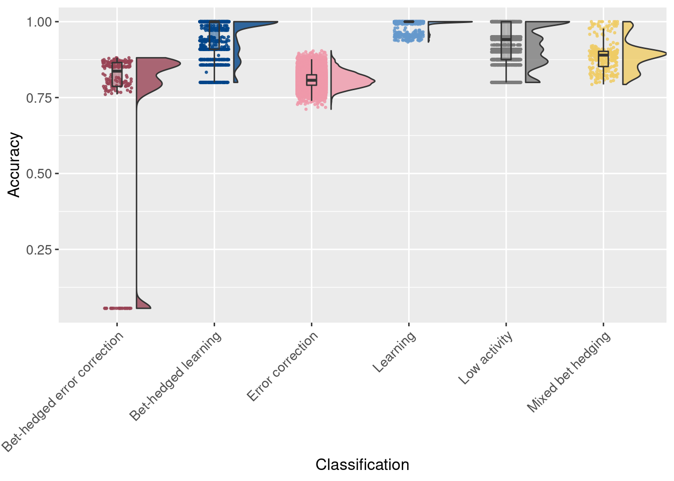
Note that merit is plotted on a logarithmic (base 2) scale:
# Raincloud plot of merit
ggplot(df, aes(x = seed_classification_factor, y = merit, fill = seed_classification_factor)) +
  geom_flat_violin(scale="width", position = position_nudge(x = .2, y = 0), alpha = .8 ) +
  geom_point(mapping=aes(color=seed_classification_factor), position = position_jitter(width = .15, height = 0), size = .5, alpha = 0.8 ) +
  geom_boxplot( width = .1, outlier.shape = NA, alpha = 0.5 ) +
  scale_fill_manual(values = color_map) +
  scale_color_manual(values = color_map) +
  scale_y_continuous(trans = 'log2') +
  xlab('Classification') +
  ylab('Merit') +
  theme(axis.text.x = element_text(angle=45, vjust = 1, hjust = 1)) +
  theme(axis.text = element_text(size = 10)) +
  theme(axis.title = element_text(size = 12)) +
  theme(legend.position = 'none')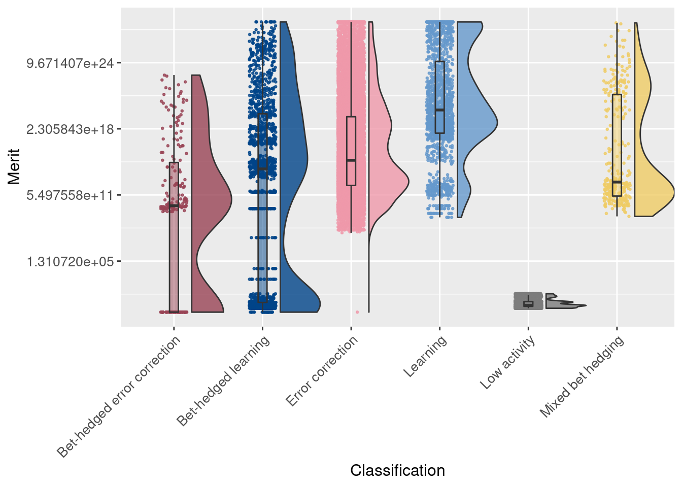
2.6 Raincloud plots (per replicate)
Finally, we again use raincloud plots, but here we look at replicates instead of individual trials. Each point represents one of the initial 200 replicates.
First we look at genome length (the ancestor had 100 instructions):
# Raincloud plot of genome length
ggplot(df_summary, aes(x = seed_classification_factor, y = genome_length, fill = seed_classification_factor)) +
  geom_flat_violin(scale="width", position = position_nudge(x = .2, y = 0), alpha = .8 ) +
  geom_point(mapping=aes(color=seed_classification_factor), position = position_jitter(width = .15, height = 0), size = .5, alpha = 0.8 ) +
  geom_boxplot( width = .1, outlier.shape = NA, alpha = 0.5 ) +
  scale_fill_manual(values = color_map) +
  scale_color_manual(values = color_map) +
  xlab('Classification') +
  ylab('Genome length') +
  theme(axis.text.x = element_text(angle=45, vjust = 1, hjust = 1)) +
  theme(axis.text = element_text(size = 10)) +
  theme(axis.title = element_text(size = 12)) +
  theme(legend.position = 'none')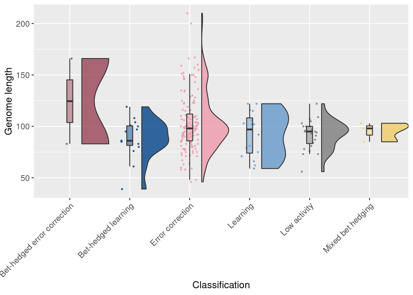
Next we look at the mean accuracy for each replicate:
# Raincloud plot of mean accuracy of replicates
ggplot(df_summary, aes(x = seed_classification_factor, y = accuracy_mean, fill = seed_classification_factor)) +
  geom_flat_violin(scale="width", position = position_nudge(x = .2, y = 0), alpha = .8 ) +
  geom_point(mapping=aes(color=seed_classification_factor), position = position_jitter(width = .15, height = 0), size = .5, alpha = 0.8 ) +
  geom_boxplot( width = .1, outlier.shape = NA, alpha = 0.5 ) +
  scale_fill_manual(values = color_map) +
  scale_color_manual(values = color_map) +
  scale_y_continuous(limits = c(0,1)) +
  xlab('Classification') +
  ylab('Mean accuracy') +
  theme(axis.text.x = element_text(angle=45, vjust = 1, hjust = 1)) +
  theme(axis.text = element_text(size = 10)) +
  theme(axis.title = element_text(size = 12)) +
  theme(legend.position = 'none')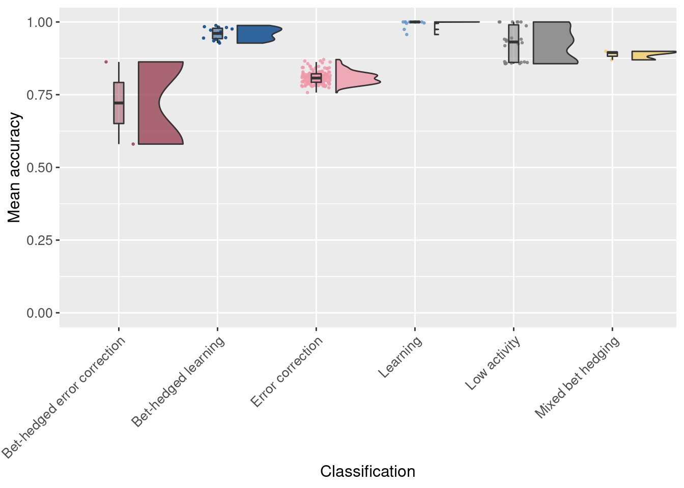
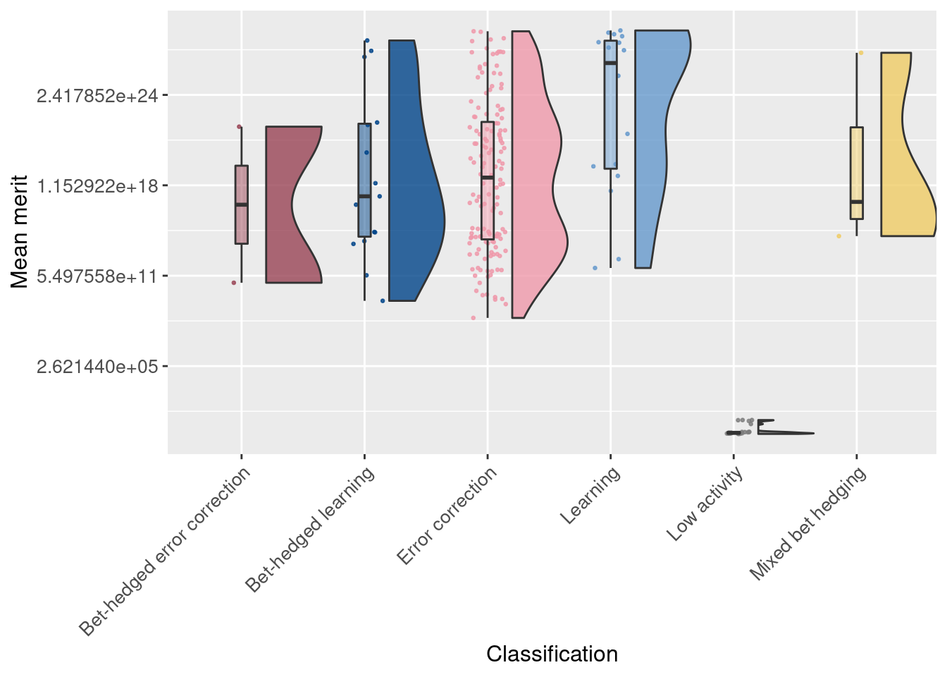
Finally, we look at the average merit for each replicate. Note that the y-axis is on a log2 scale.
# Raincloud plot of mean merit of replicates
ggplot(df_summary, aes(x = seed_classification_factor, y = merit_mean, fill = seed_classification_factor)) +
  geom_flat_violin(scale="width", position = position_nudge(x = .2, y = 0), alpha = .8 ) +
  geom_point(mapping=aes(color=seed_classification_factor), position = position_jitter(width = .15, height = 0), size = .5, alpha = 0.8 ) +
  geom_boxplot( width = .1, outlier.shape = NA, alpha = 0.5 ) +
  scale_fill_manual(values = color_map) +
  scale_color_manual(values = color_map) +
  scale_y_continuous(trans = 'log2') +
  xlab('Classification') +
  ylab('Mean merit') +
  theme(axis.text.x = element_text(angle=45, vjust = 1, hjust = 1)) +
  theme(axis.text = element_text(size = 10)) +
  theme(axis.title = element_text(size = 12)) +
  theme(legend.position = 'none')